A financial ratio is a single division — operating income over revenue, net income over equity — but one value in isolation is nearly meaningless. A 20% margin can be a triumph or a decline depending entirely on the path that led there. The information lives in the trajectory: forty fiscal years of the same ratio, computed the same way, side by side.
Computing that by hand means pulling forty annual reports per company, which is why almost nobody does it. Below, what the full ratio history looks like when it is already computed — Apple’s four decades of margins and returns on capital, exactly as the Ratios tab of Slowio’s stock financials draws them.
Every ratio, already computed
Sizing up a business usually means computing the same ratios over and over — price against earnings and book value, margins, returns on capital, debt against equity — for every fiscal year, from statements scattered across decades of annual reports. The ratios page does that arithmetic in advance: valuation, profitability and balance-sheet ratios, computed per fiscal year for each of the thousands of companies Slowio follows, and already charted.
Here is what that looks like for Apple Inc. — 41 fiscal years of ratio history, two of the charts the ratios page opens with:
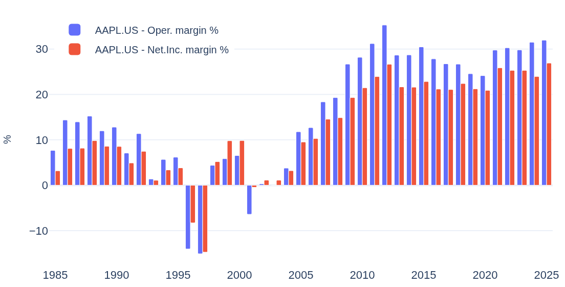
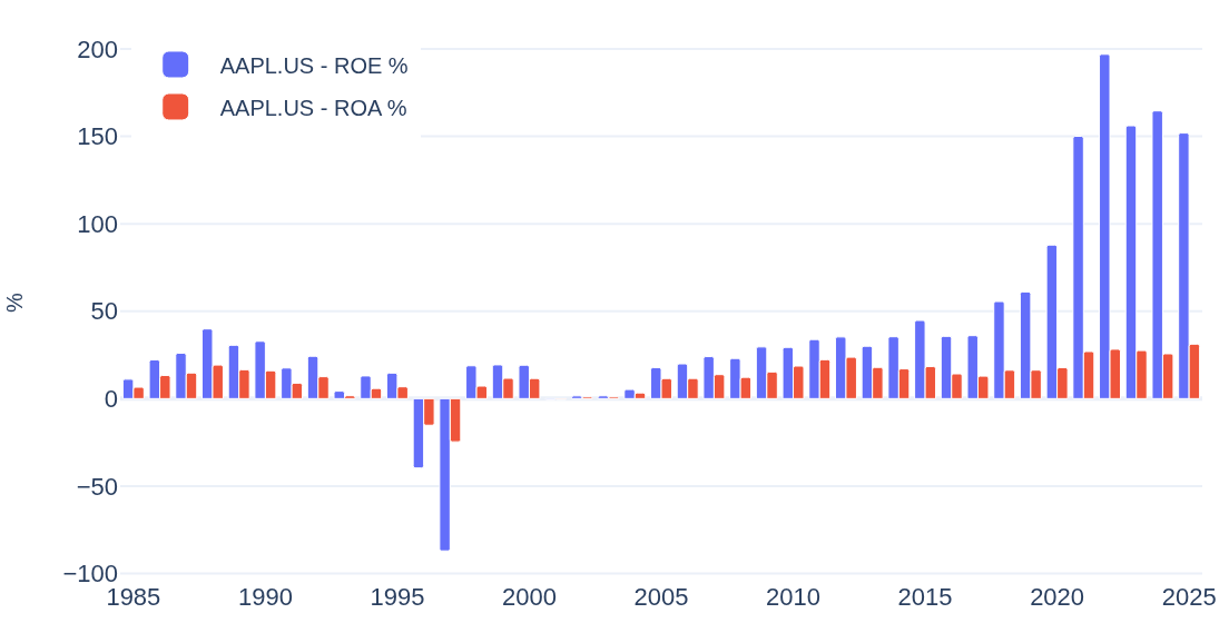
The history is the story: operating margin went from 8% in 1985, through -15% in 1997, to 32% in 2025 — and every reading in between is one bar on the chart. Under the charts sit the latest numbers themselves. Apple Inc., FY 2025:
AAPL.US · Apple Inc.
Technology · Consumer Electronics · USA
Every figure is computed the same way for every company, so a ratio read here can be lined up against any other company — or against its own value ten, twenty or forty years ago. Swap the ticker in the page URL, or use the search box, to see any other company the same way.
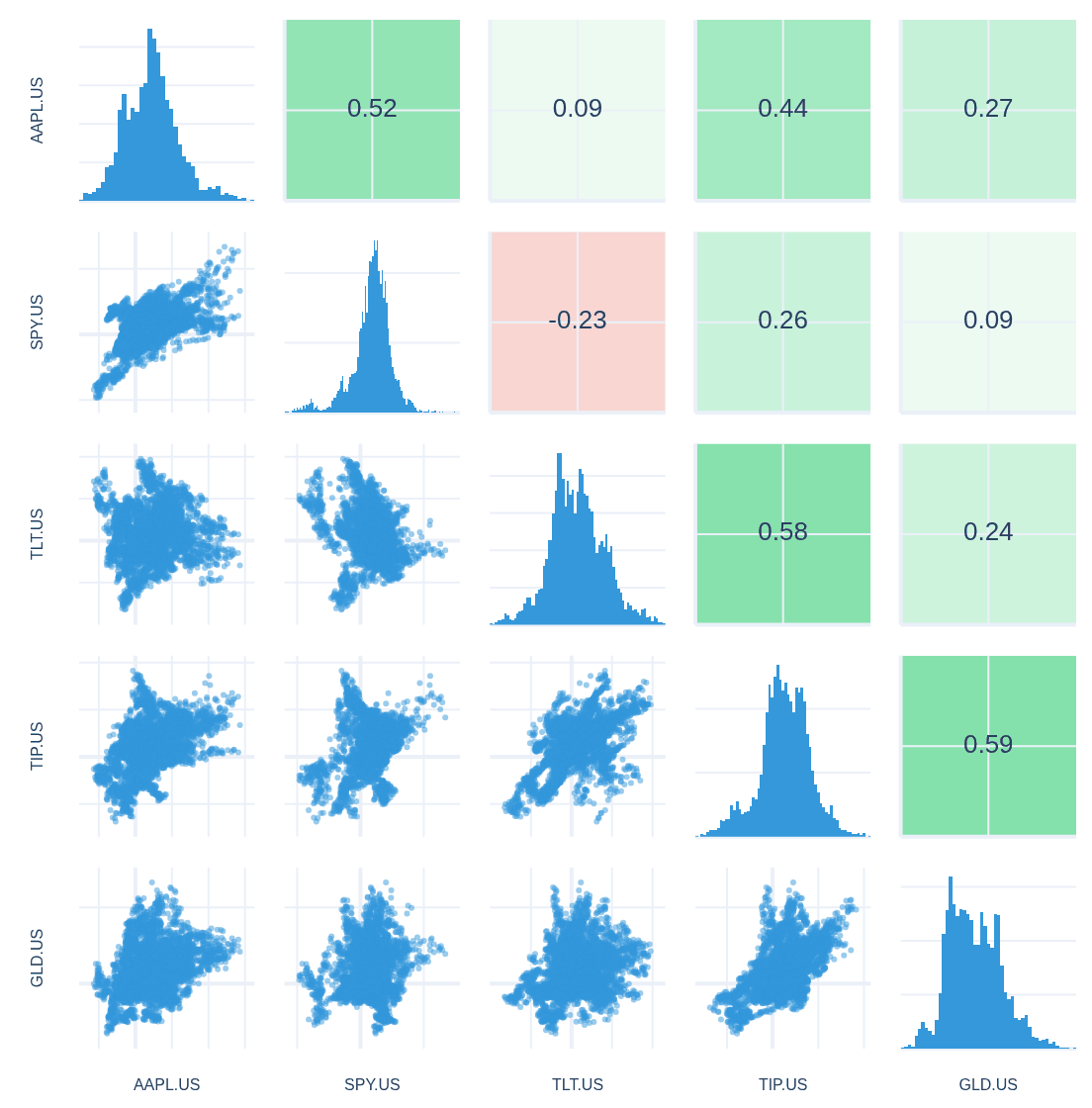
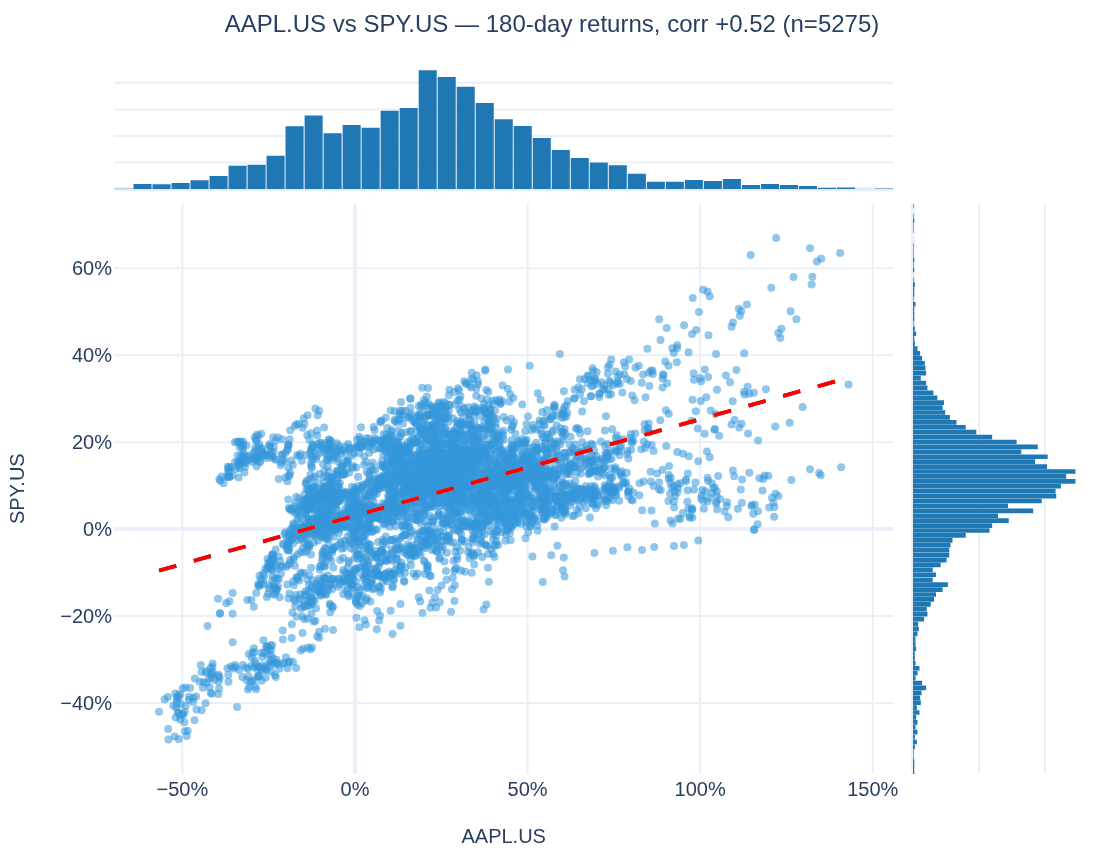
And one step further — the Correlations tab puts Apple Inc. next to the four big asset classes: US equities (SPY.US), long-term Treasuries (TLT.US), inflation-linked Treasuries (TIP.US) and gold (GLD.US). Over 180-day returns since 2005, the tightest link is AAPL.US–SPY.US at +0.52; against long-term Treasuries it drops to +0.09.
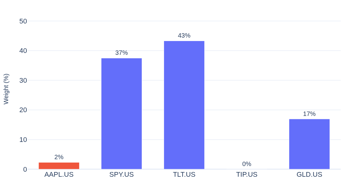
What weight does Apple Inc. get in that mix? The Rebalance & Opt. tab’s Max Diversification objective — the weights that damp how much the five move together — answers with numbers: the optimizer gives AAPL.US a 2% seat, though the diversification ratio barely moves (1.72 versus 1.72 without it).