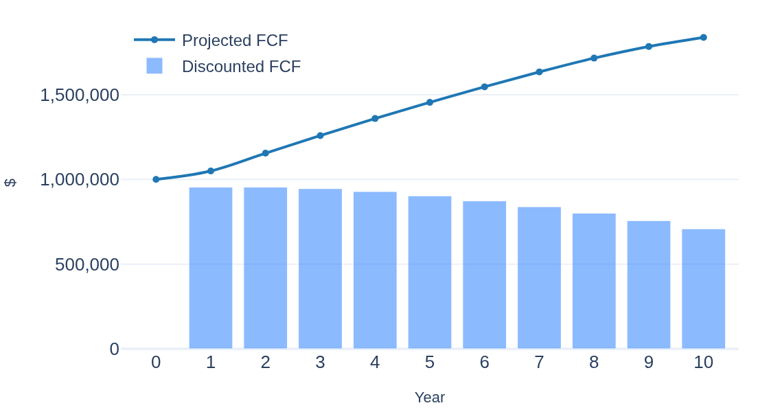
DCF Valuation Step by Step: What Future Cash Flows Are Worth Today
A discounted cash flow walkthrough with no shortcuts: projecting free cash flow, discounting, terminal value — every formula shown and every assumption stated.
Read the article →Notes on value investing, company analysis and portfolio arithmetic.
A discounted cash flow walkthrough with no shortcuts: projecting free cash flow, discounting, terminal value — every formula shown and every assumption stated.
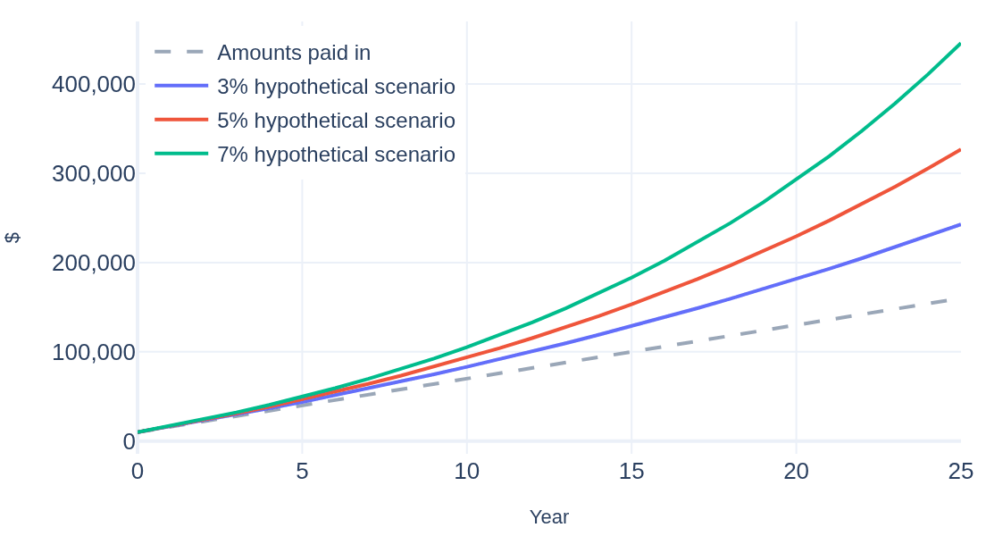
Read the article →What compounding actually does over 25 years at 3%, 5% and 7% — including the breakeven year and the measurable cost of starting later. An educational walkthrough.
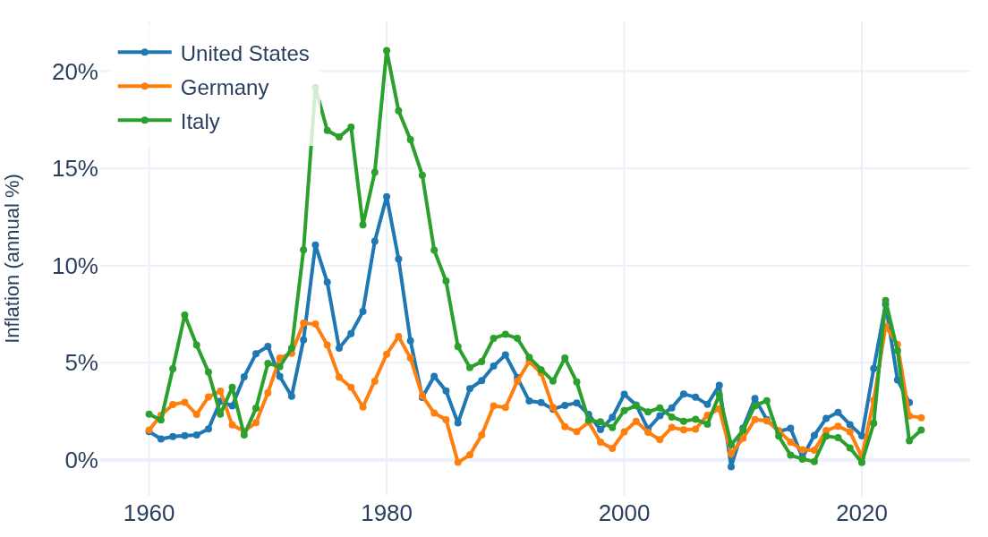
Inflation history, cumulative price-level drift, GDP and market size — the handful of macro series worth knowing, charted across decades for the US, Germany and Italy.
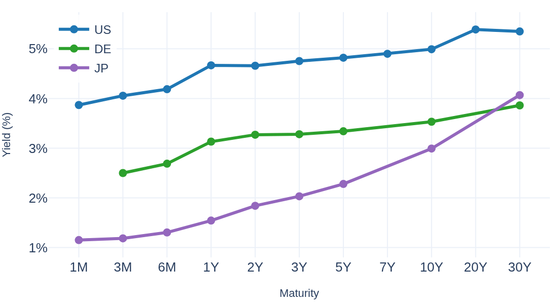
Yield curves, term spreads, cross-country spreads and real yields — what each one measures and how to read them, in five charts of actual government bond data.
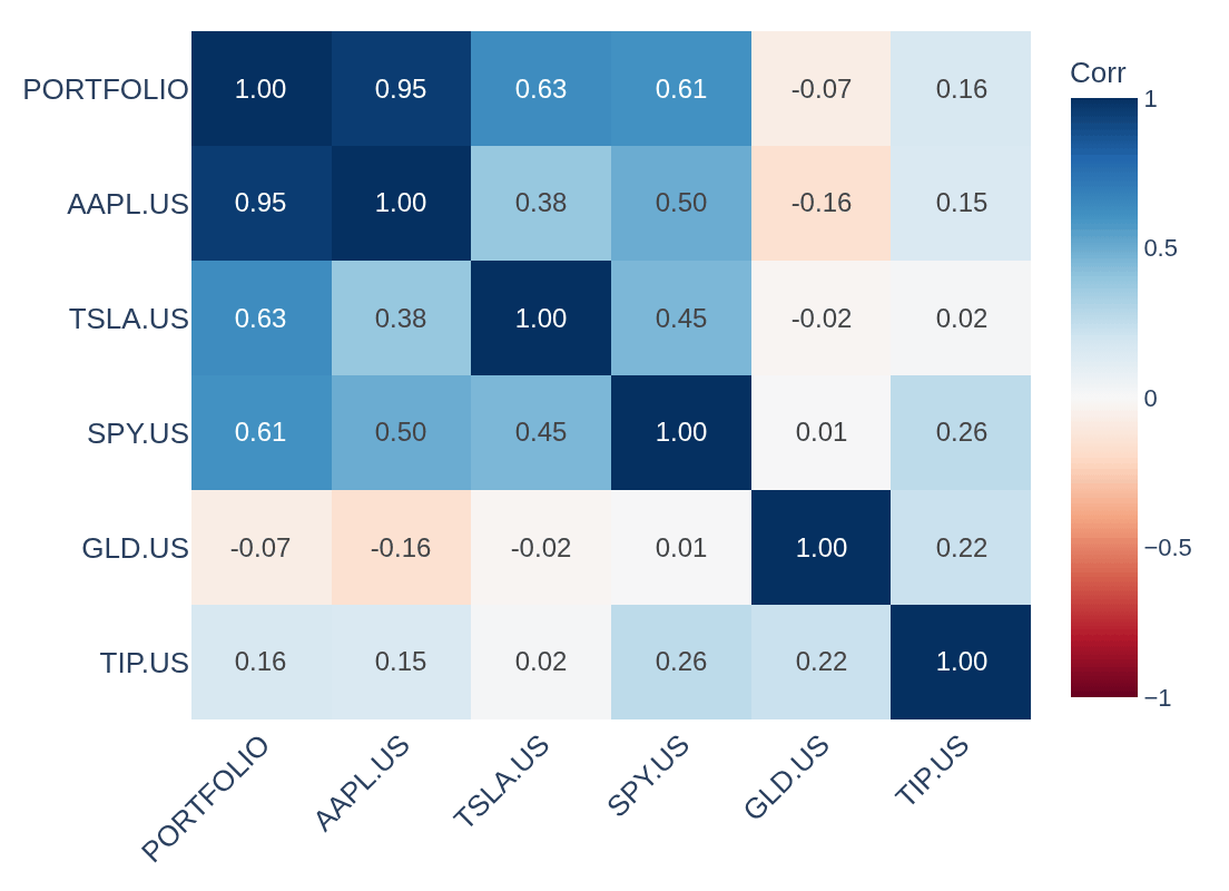
Counting positions is not diversification. Correlation heatmaps, rolling correlations and risk contribution — how to measure whether holdings actually offset each other.
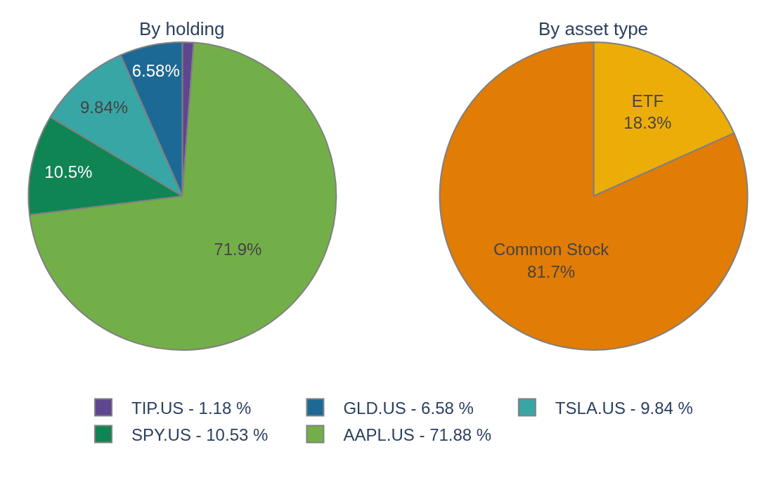
Beyond the list of tickers: look-through allocation, sector concentration, dividend-inclusive performance and per-holding attribution — on a worked example portfolio.
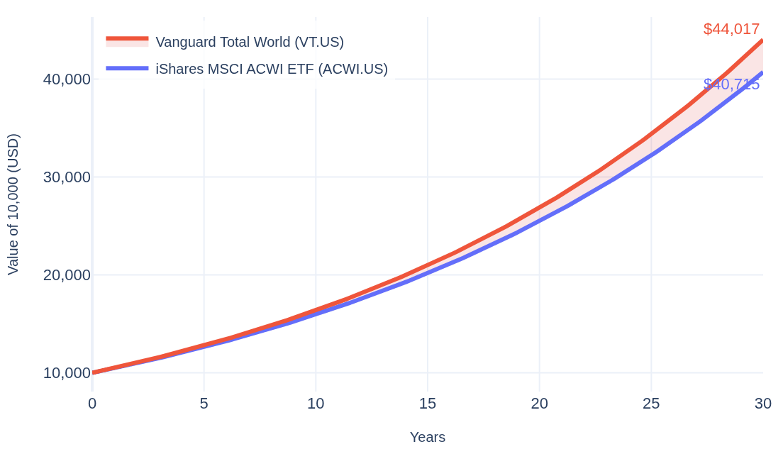
A 0.25% fee difference looks tiny and is not: how expense ratios compound over 30 years, shown with two world ETFs tracking nearly the same index.
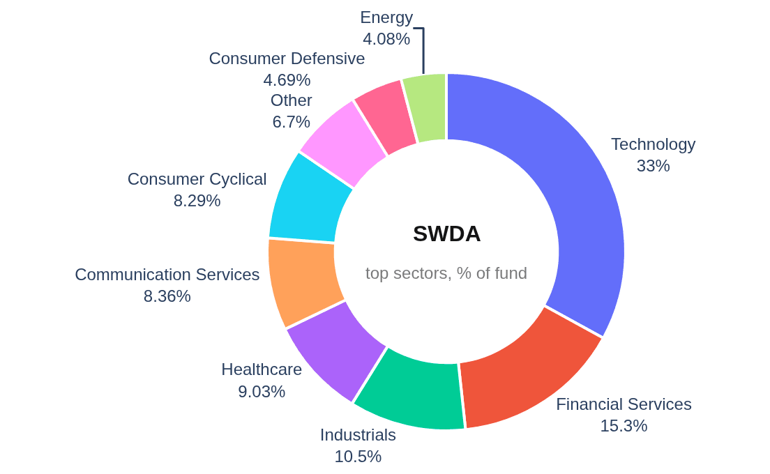
Two ETFs with near-identical names can hold very different things. Sector donuts, holdings flows and fee twins — how to see inside a fund before comparing it to anything.
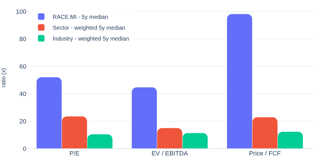
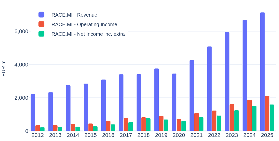
A P/E of 18 means nothing on its own. How sector and industry weighted medians turn raw ratios into context — Ferrari vs the auto industry as a worked example.
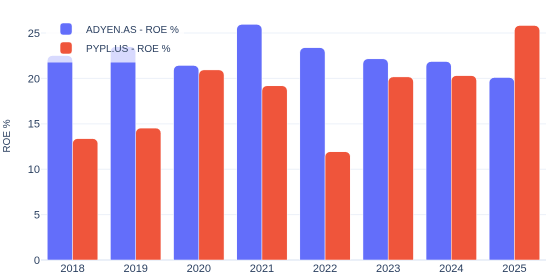
Comparing two companies fairly: same scores, same ratios, same fiscal-year axis. Adyen vs PayPal as a worked example of a side-by-side stock comparison.
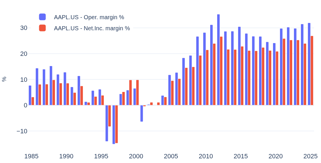
Margins, ROE, ROA and valuation ratios — what they mean and why the 40-year trajectory matters more than any single year, shown on Apple’s full history.
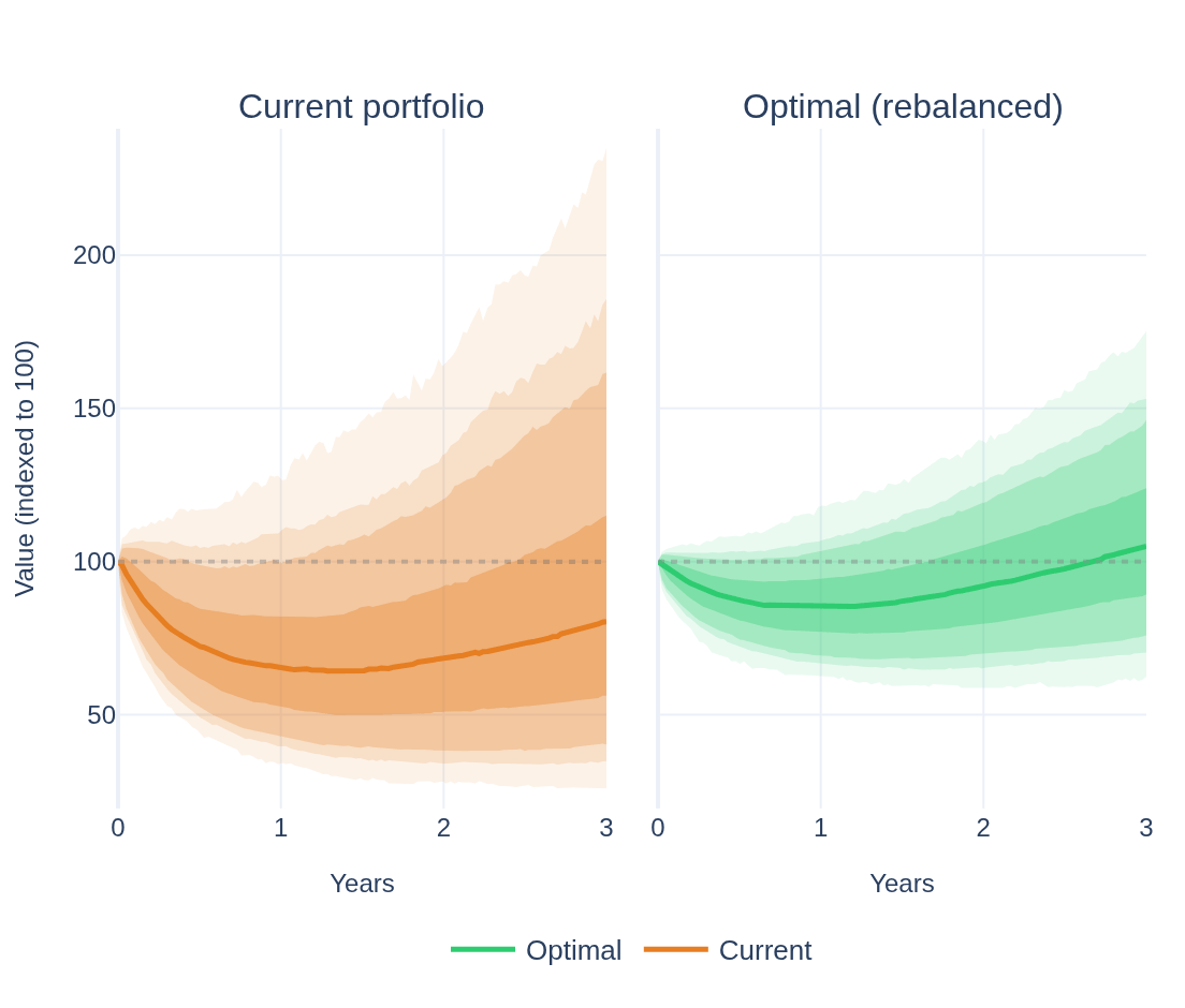
What Monte Carlo scenario simulation shows about a portfolio: crisis, bear and bull regimes, fan charts, drawdowns — and what diversification actually costs and buys.
A fast, repeatable way to read a company’s financial statements: four 0–100 scores, then decades of income, cash-flow and debt history — shown on real data.
No article matches.