
Government bond yields are the reference prices of the financial system — the baseline every other asset is implicitly compared against. But the single quoted yield hides the structure that matters: how yields differ by maturity (the curve), how the long end compares to the short end (the term spread), how one country prices against another, and what remains after inflation (the real yield).
Each of those is one chart. Below, all five drawn from actual sovereign yield data — the same views Slowio’s bonds page builds for about twenty-six countries.
Government bond yields, curves and spreads — one page
Bond yields set the baseline every other asset is measured against. The Bonds page on Slowio tracks government bond yields for 58 countries — full yield curves, yields over time, and the spreads between maturities and between countries that markets watch most closely.
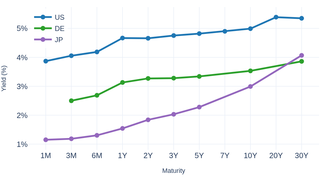
The shape of that curve is itself a signal. On the snapshot the US curve is upward-sloping: the 10-year yields 4.99% against 4.66% for the 2-year — a +0.33 pp term spread, the reading the Spreads & Signals tab tracks as a classic recession indicator (inversions have preceded past US recessions).
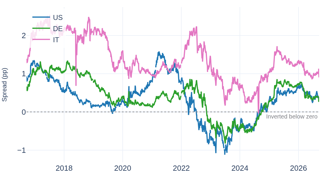
Drawn over time, that single number becomes a strip chart of the cycle. The US spread spent 22% of the window below zero — the longest inversion ran from July 2022 to September 2024, bottoming at -1.12 pp — and now reads +0.33 pp; Germany sits at +0.26 pp, Italy at +0.90 pp:
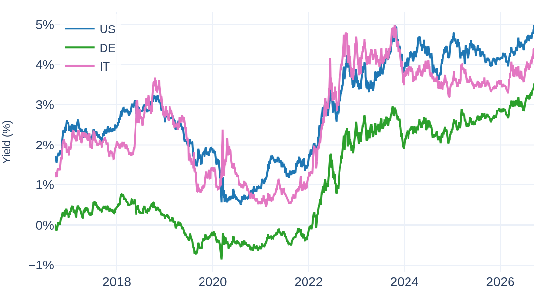
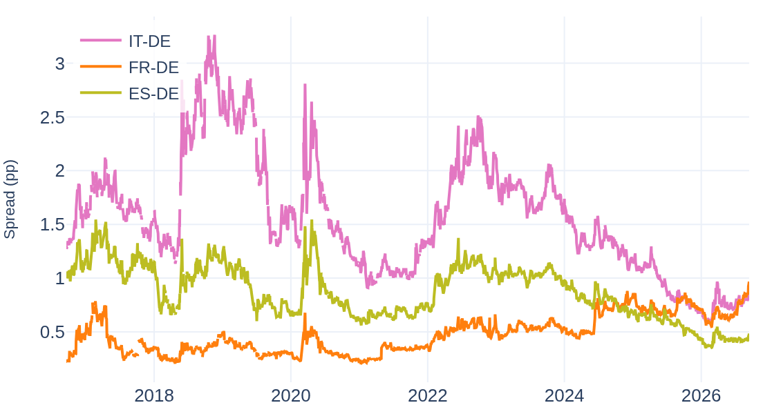
The lines above are one view; their differences are the sharper one. Subtract Germany — the euro area’s benchmark — and what remains is the premium each country pays for its risk: Italy’s reached +3.26 pp in November 2018 and stands at +0.86 pp today; France pays +0.97 pp (its own decade peak, +0.97 pp, came in September 2026), Spain +0.48 pp — currently below France:
Behind the charts, the page keeps the headline readings current:
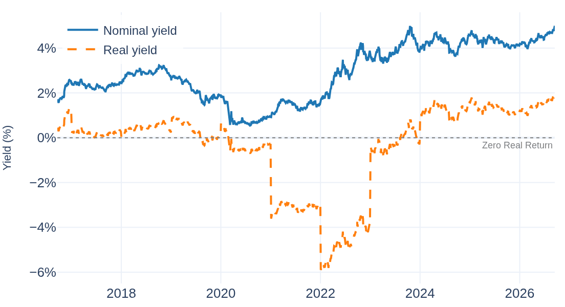
One tab deserves a closer look. A yield quote says nothing about purchasing power, so Historical Analysis subtracts inflation from it (the Fisher equation, using the macro module’s inflation data). On the snapshot the US 10-year yields 4.99% nominal but 1.98% real after 2.95% inflation. And for 39% of the past decade the real number sat below zero, bottoming at -5.90% in January 2022, when 1.63% nominal met 8.00% inflation:
Six tabs in total: Yield Curves (with historical curve overlays), Spreads & Signals, Rates Comparison, Historical Analysis, Correlations, and a Cross-Module view linking yields to macro data.