
Company analysis happens inside a macro context whether or not anyone looks at it. Inflation quietly resets what a “good” return means; GDP growth sets the tide most businesses float on; and the cumulative price level — not the yearly rate — is what actually erodes purchasing power over a holding period measured in decades.
A few long series carry most of the signal. Below, inflation, price levels, GDP, exports and market size for three economies across sixty years — the same views Slowio’s macro dashboard builds for over a hundred countries.
The macro picture behind every market
Every company and every bond trades inside an economy. The Macro page on Slowio charts 39 macroeconomic indicators for 125 economies — growth, inflation, unemployment, debt, trade, demographics — with annual history reaching back to 1960. 65 years of inflation, in one chart:
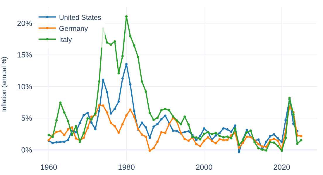
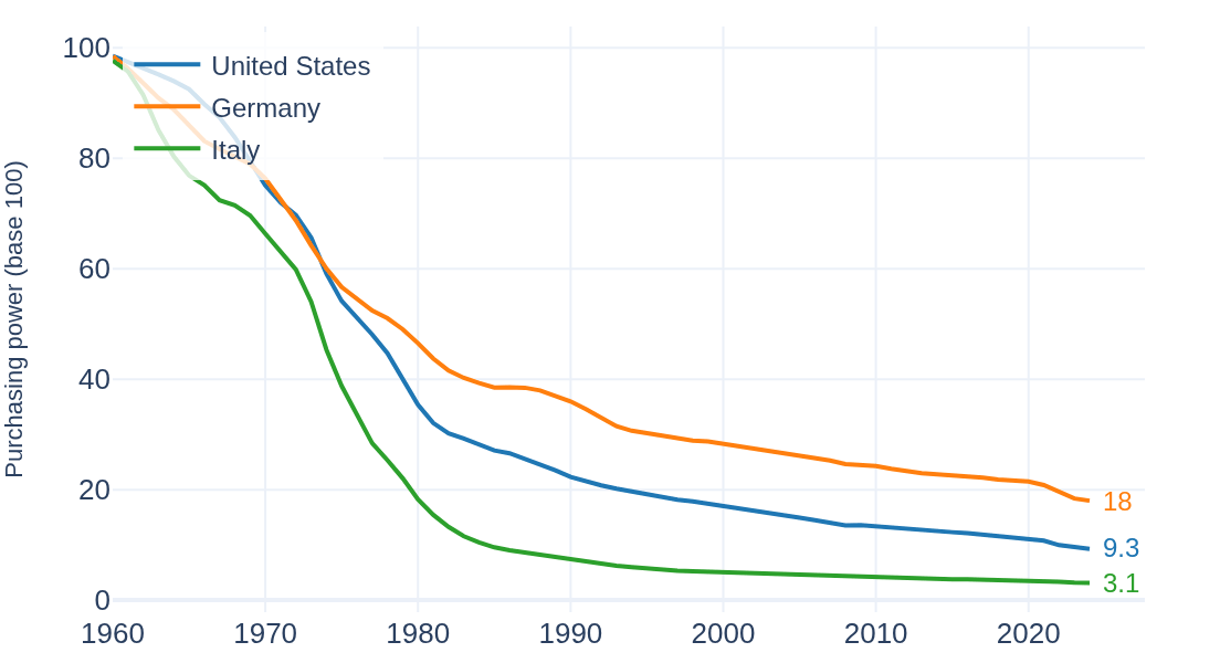
Those yearly percentages compound. Chained across the 65 common years on file, prices multiplied ×11 in United States (peak 13.5% in 1980), ×6 in Germany (peak 7.0% in 1973), ×32 in Italy (peak 21.1% in 1980). Flipped around: of 100 units of 1960 purchasing power, what remains today is Germany 18, United States 9.3, Italy 3.1:
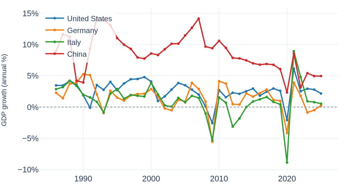
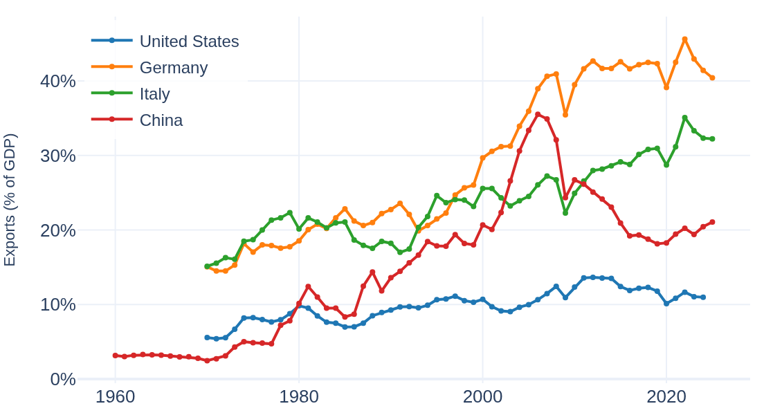
Inflation is one indicator of 39. The same tab draws the rest — three more, from the growth, trade and markets groups:
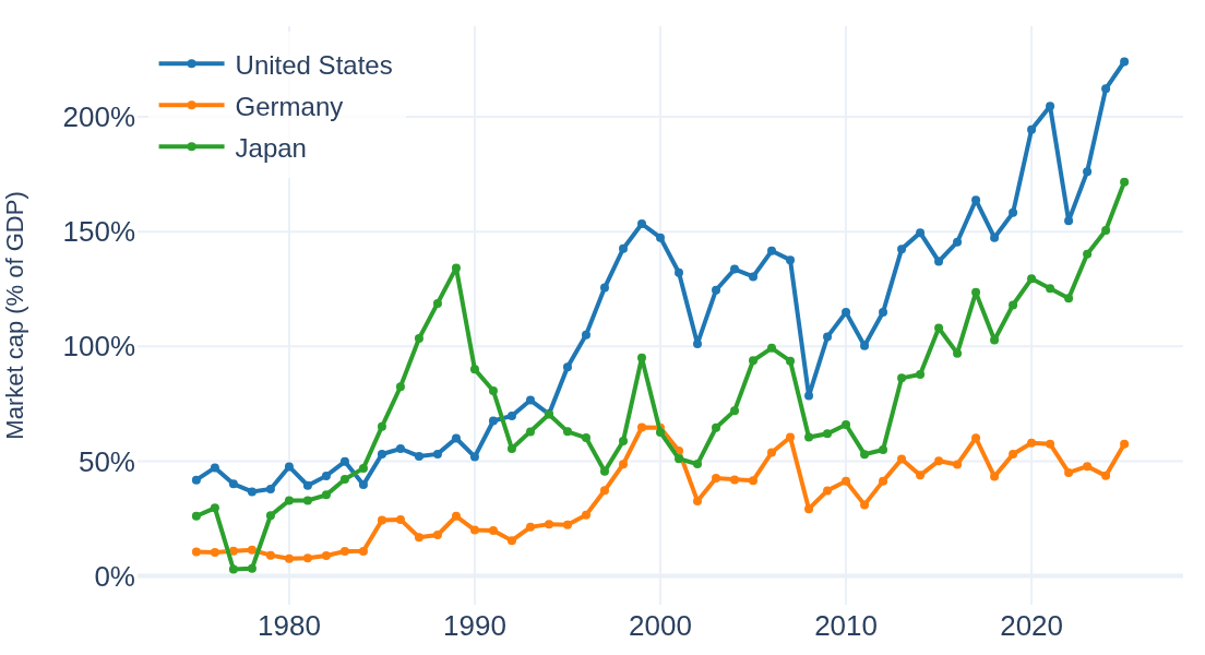
The same page condenses each economy into summary cards — the latest readings for United States, Germany and Italy on this snapshot:
Beyond the time series: country-vs-country comparison, a world map for any indicator, multi-indicator overlays, economic structure, trade and debt & fiscal dashboards, trend statistics, and correlations — including a cross-module view linking macro data to bond yields.