
Diversification is routinely measured by counting positions, and the count is routinely misleading. Five holdings that rise and fall together are one bet written five times; the protection everyone assumes from “not putting everything in one place” only exists if the pieces actually move differently.
Whether they do is measurable: pairwise correlations over a rolling window, the portfolio’s weighted average against each holding, and each position’s share of total variance. Below, the full risk pass on a worked example — including what an optimizer would change and why.
Five holdings — or one bet five times?
A portfolio of five names that all move together behaves like a single position. The Correlations tab measures it instead of guessing: every pair of holdings, scored from −1 (moves opposite) to +1 (moves in lockstep). Every new Slowio account starts with a small sample portfolio — two stocks and three ETFs. It makes an honest test subject, because every figure below can be reproduced on the Portfolio page.
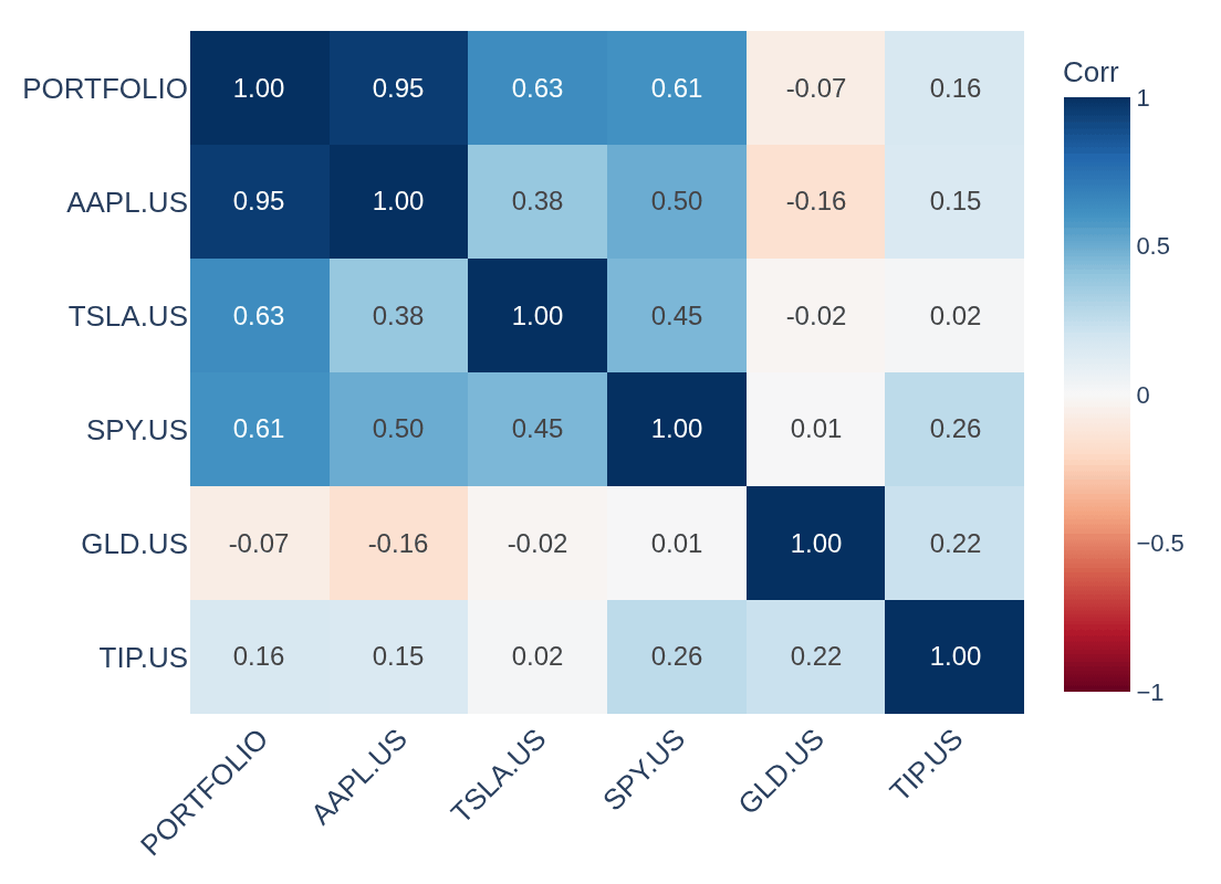
The pattern is visible at a glance: the stocks and the S&P 500 fund cluster together (AAPL–SPY at 0.50), while the gold fund sits apart from the stocks (AAPL–GLD at -0.16) — the reason mixing asset types changes how a portfolio moves:
The PORTFOLIO row is the concentration story in one line: AAPL moves with the whole portfolio at 0.95, while GLD barely registers at -0.07.
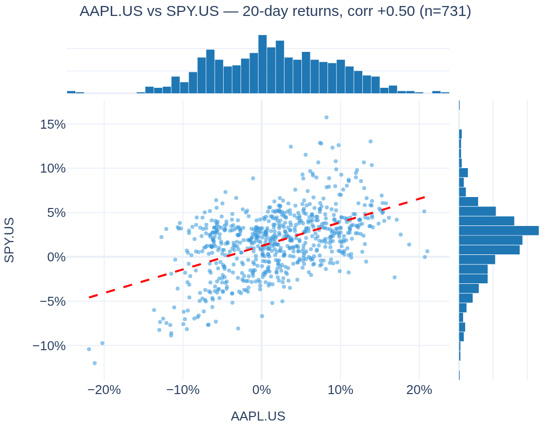
What a correlation of 0.50 looks like. Every dot below is one 20-day stretch — AAPL’s return across, SPY’s return up. The tab draws this view for any pair: histograms on the margins, a regression line through the cloud:
Is “uncorrelated” a promise? No — every number in the heatmap is a three-year average, and averages move. The tab’s rolling view redraws the correlation of a pair week after week:
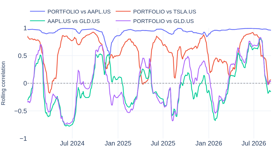
The AAPL–GLD pair averages -0.16 over the whole window — but along the way it swung all the way from -0.78 to 0.81 (today: -0.15). Diversification is a moving target; this view shows when it held and when it didn’t.
The same tab adds an adjustable return period and rolling window, and lets any company or ETF Slowio follows be added to the matrix — for any portfolio or watchlist.
Weights drift. A position that doubles quietly rewrites the whole portfolio’s risk. The Rebalance & Opt. tab runs a classical portfolio optimizer on the actual holdings and shows the gap between the weights a portfolio has and the weights a chosen objective would give it — here on the same sample portfolio.
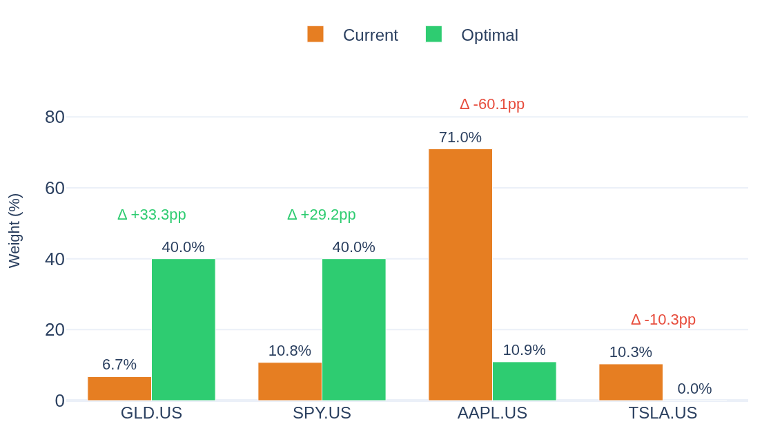
On the last three years of data, the Max Sharpe weights would have kept roughly the same expected return at less than half the volatility — mostly by trimming the AAPL.US position from 71% to 11%:
Where the risk actually lives. Weights say where the money is; the tab’s risk-contribution view says where the swings come from — each holding’s share of the portfolio’s variance, before and after the optimizer:
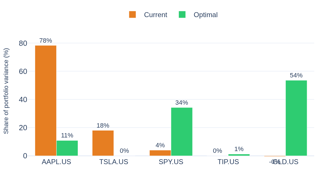
AAPL is 71% of the money but 78% of the risk — concentration compounds faster in variance than in weight. The Max Sharpe weights would cut that holding’s risk share to 11%.
The optimizer’s output is a statement about past returns, not a forecast — the tab makes the assumptions explicit (objective, lookback, per-holding cap) and lets each one be changed. Five objectives are available, from minimum volatility to risk parity, plus the efficient frontier.