
A portfolio is usually described as a list of tickers and weights, but that list hides more than it shows. An ETF line is really hundreds of underlying positions; two “different” holdings can be the same sector bet twice; and a flat total return can hide one big winner paying for several quiet losers.
Look-through analysis unpacks the list: what the portfolio actually holds once funds are opened up, how concentrated the sector exposure really is, and which positions produced the result — dividends included. Below, the full pass on a worked example portfolio.
What a portfolio actually holds — and what it did
A list of tickers hides its own shape: one position quietly grows into half the total, three funds turn out to overlap, everything sits in one currency. The Allocations tab redraws a portfolio as weights — by holding, sector, industry, country, currency and type. Every new Slowio account starts with a small sample portfolio — two stocks and three ETFs. It makes an honest test subject, because every figure below can be reproduced on the Portfolio page.
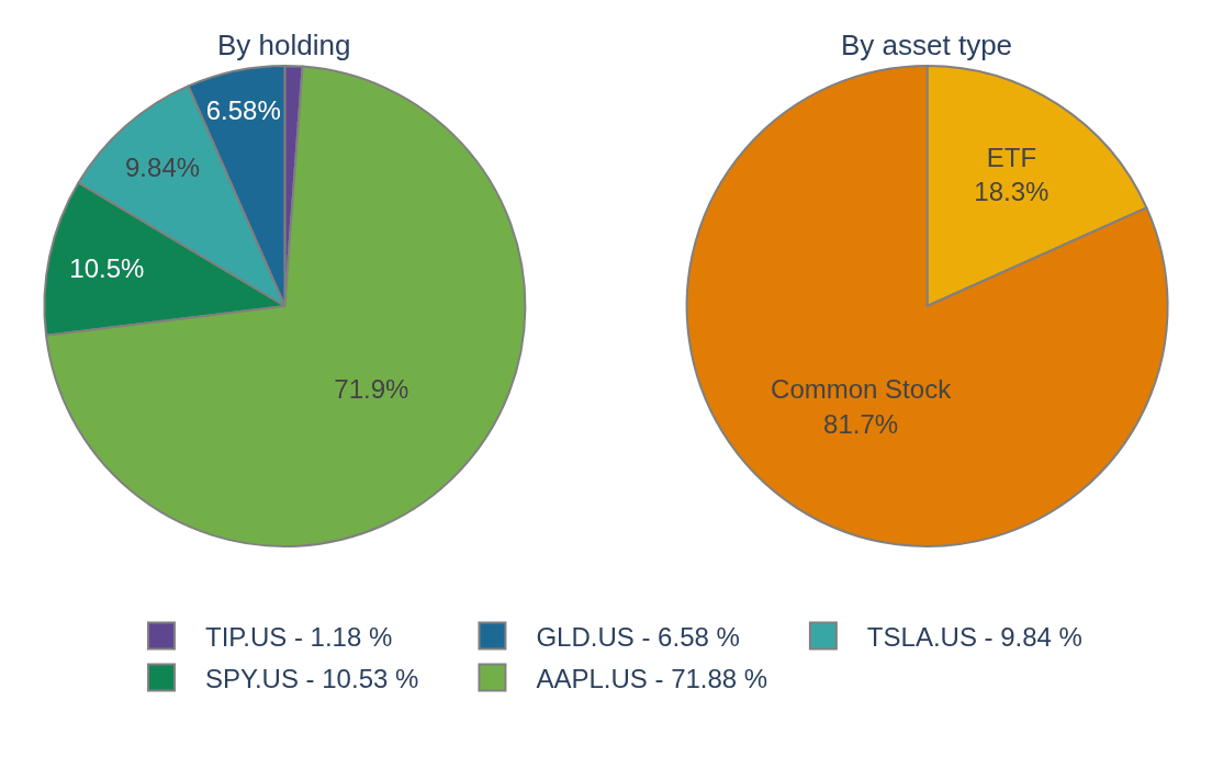
One holding — Apple Inc. — has grown to 71.9% of the whole portfolio. That is exactly the kind of fact a table of tickers keeps to itself. The tab’s concentration cards turn that into one number: these five holdings behave like 1.8 equally-weighted positions.
What’s inside the funds? 3 of the 5 holdings are funds — 18.3% of the portfolio the pies above can only label “ETF”. The tab’s look-through opens them up: stocks count directly, funds are split into their own published sector weights.
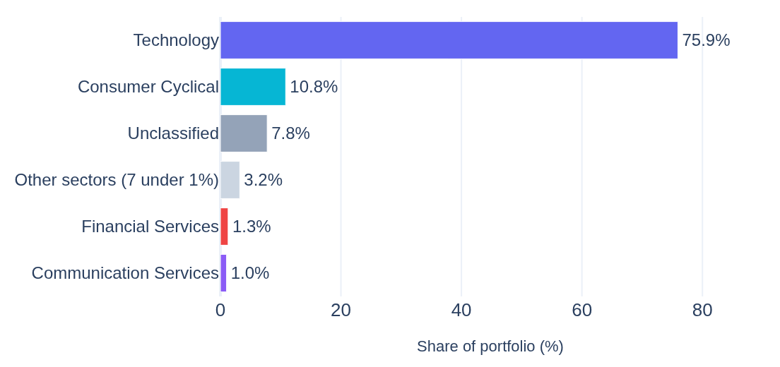
The point: this portfolio’s real technology exposure is 75.9%, not the 71.9% the Apple position alone suggests. The S&P 500 fund quietly adds 4.0 points more of the same bet — about 38% of that fund is technology stocks. The remaining 7.8% is the only part of the portfolio that is truly not an equity bet. The look-through also works by country and region, on any portfolio or watchlist.
The same tab adds treemap, sunburst and donut views, a geographic exposure map, and a full concentration panel (HHI, Lorenz curve, Gini) — the anatomy of any portfolio or watchlist.
“Is it up?” is really three questions: how much cash went in, what it is worth now, and how the gap between the two built up over time. The Performance tab answers all three at once — dividends included, on the same sample portfolio:
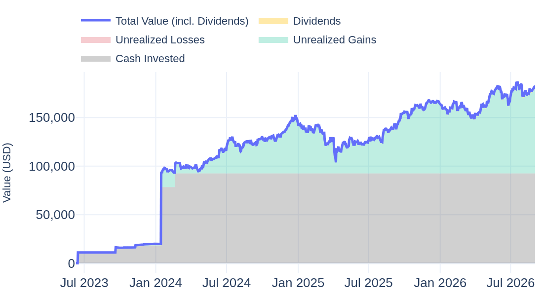
The tiles above the chart condense it to the headline numbers — including the 1,916 USD of dividends a price-only view would miss. It also keeps the uncomfortable part: early on, the portfolio spent 39 days worth less than the cash that had gone in — at the worst point 565 USD under water (Oct 2023). The chart’s Unrealized Losses layer records those stretches — here a sliver of red barely visible at today’s scale — the kind of detail a summary row erases.
Who did the work? A portfolio return is an average, and averages hide their parts. The tab’s Positions view splits the 90,376 USD result into one bar per holding — price moves and dividends counted together:
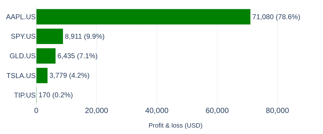
One holding — Apple — produced 79% of the whole result. And the quietest bar teaches the loudest lesson: TIP’s price actually lost 39 USD — its 208 USD of dividends is the only reason it shows green. The same view adds per-position weights, concentration analysis and a sortable table.
The same tab overlays a benchmark of choice, splits realized from unrealized results, isolates the currency effect for holdings in foreign currencies, and breaks returns down per period.