
A single expected-return number says almost nothing about what holding a portfolio feels like. The same five holdings can sail through one decade and lose a third of their value in a different one — the outcome is a distribution, not a point. Monte Carlo simulation makes that distribution visible: thousands of hypothetical paths through crisis, bear and bull regimes calibrated on the portfolio’s own history.
The interesting part is comparing two versions of the same portfolio — as it is, and rebalanced toward better diversification — across the same simulated futures. The trade-off is honest: the cushion in bad regimes is paid for with upside in good ones. Below, one real run of the simulation, with every number computed.
Three futures for one portfolio
A portfolio’s real test isn’t the average year — it’s the bad one. Slowio’s scenario simulator runs 3,000 simulated paths for a portfolio in each of three market regimes — a crisis, a bear market and a bull market — each calibrated from the portfolio’s own worst, weakest and strongest historical stretches. It runs two portfolios side by side: the current, concentrated mix (“Current”) and the Max Diversification optimizer’s spread (“Optimal”). A simulation is a range of hypothetical outcomes under stated assumptions — not a prediction.
The demo portfolio looks diversified — five holdings across stocks, an index fund, gold and bonds — but AAPL alone is 72% of the money and about 78% of the risk. Here is what a crash does to it, indexed to 100 at the start.
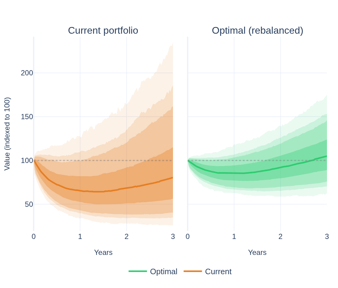
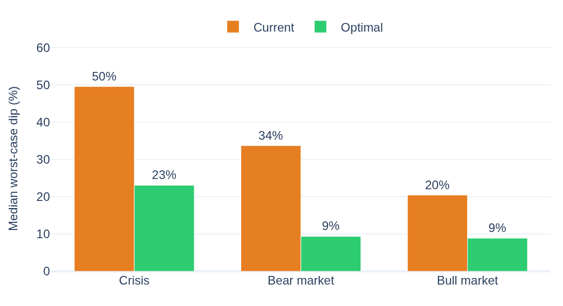
In the crisis scenario the concentrated portfolio’s median path lands near -20% after a worst-case dip of about 50% along the way, and ends underwater in 70% of the runs. The diversified mix takes a much gentler 23% dip, lands near +5%, and is underwater in 40% of them. Same shock, far less damage — because the loss isn’t riding on a single name.
The whole trade, in one picture
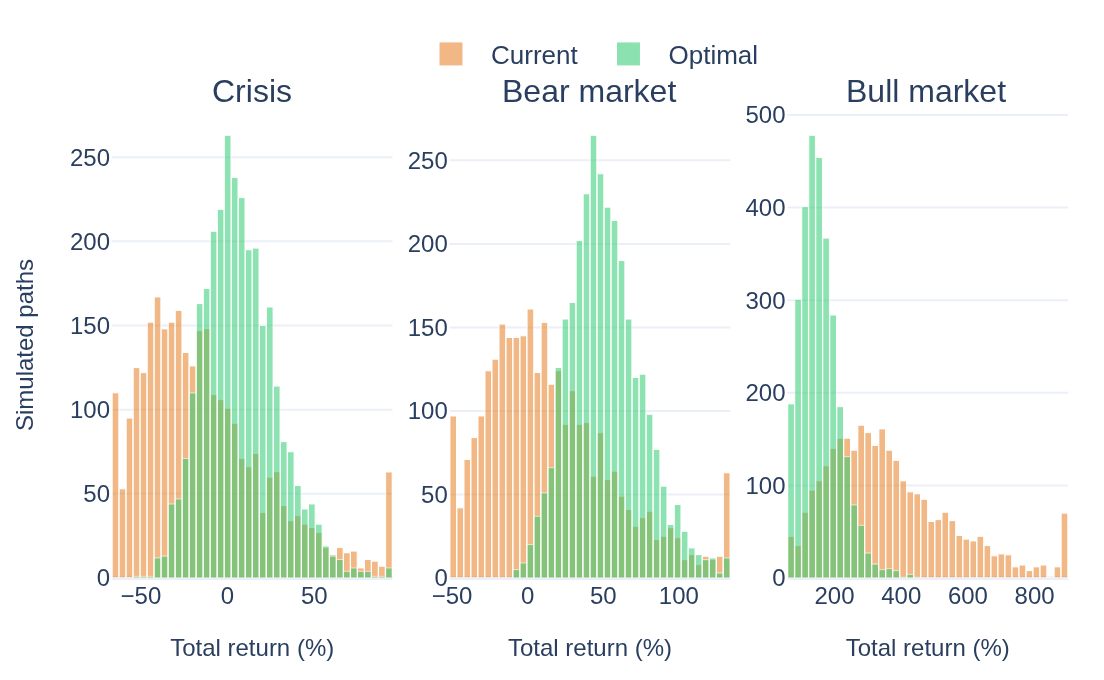
The distribution of end results tells the whole trade. In the crisis and bear panels the diversified mix (green) clusters higher — fewer deep losses. In the bull panel the concentrated one (orange) keeps the long right tail: its median boom of +331% beats the diversified +148%. That upside is the price of the protection — diversification isn’t free, it’s a trade.
A steadier ride in every scenario
And the worst-case dip — the deepest fall along the path, not just the end value — is shallower for the diversified mix in every regime, crisis, bear and bull alike. A steadier ride is the point.
Under the hood the diversified mix runs at about 9% annualized volatility versus 21% for the concentrated one — the same shocks, spread across assets that don’t all move together. It’s one of Slowio’s advanced tools — in the Rebalance & Opt. tab you can run it on your own holdings, pick the horizon and the optimizer objective, and read the full scenario table.